I decided to redesign my logo and create business cards that reflect my business identity and values. As it is currently a small business, I designed this logo for the website and business cards only, as a comprehensive corporate identity is not needed at this point. My core values are collaboration and interculturalism, which I express through art writing and design.
Year
- 2025
Tools
- Affinity Designer
- Affinity Photo
02. Approach
When creating the logo and the business cards, I have to solve these design problems. Here are the following questions:
- How do I reflect my identity and values on the business cards?
- Cultural clashes are common in reality. How do I interpret the clashes into something that remains legible yet pleasing to the eye?
- How do I show people how to pronounce my name, especially when my name is not pronounced as it is read?
03. Process
The questions above are crucial in designing my logo and the business cards. Design has standard rules that improve communication through visuals, such as limiting typography to 2-3 typefaces for legibility and using different shades of complementary colours rather than extremely contrasting ones, which are disturbing to the eyes. The process is divided into two sections: the logo and the business card design.
Logo Design

Monogram sketches
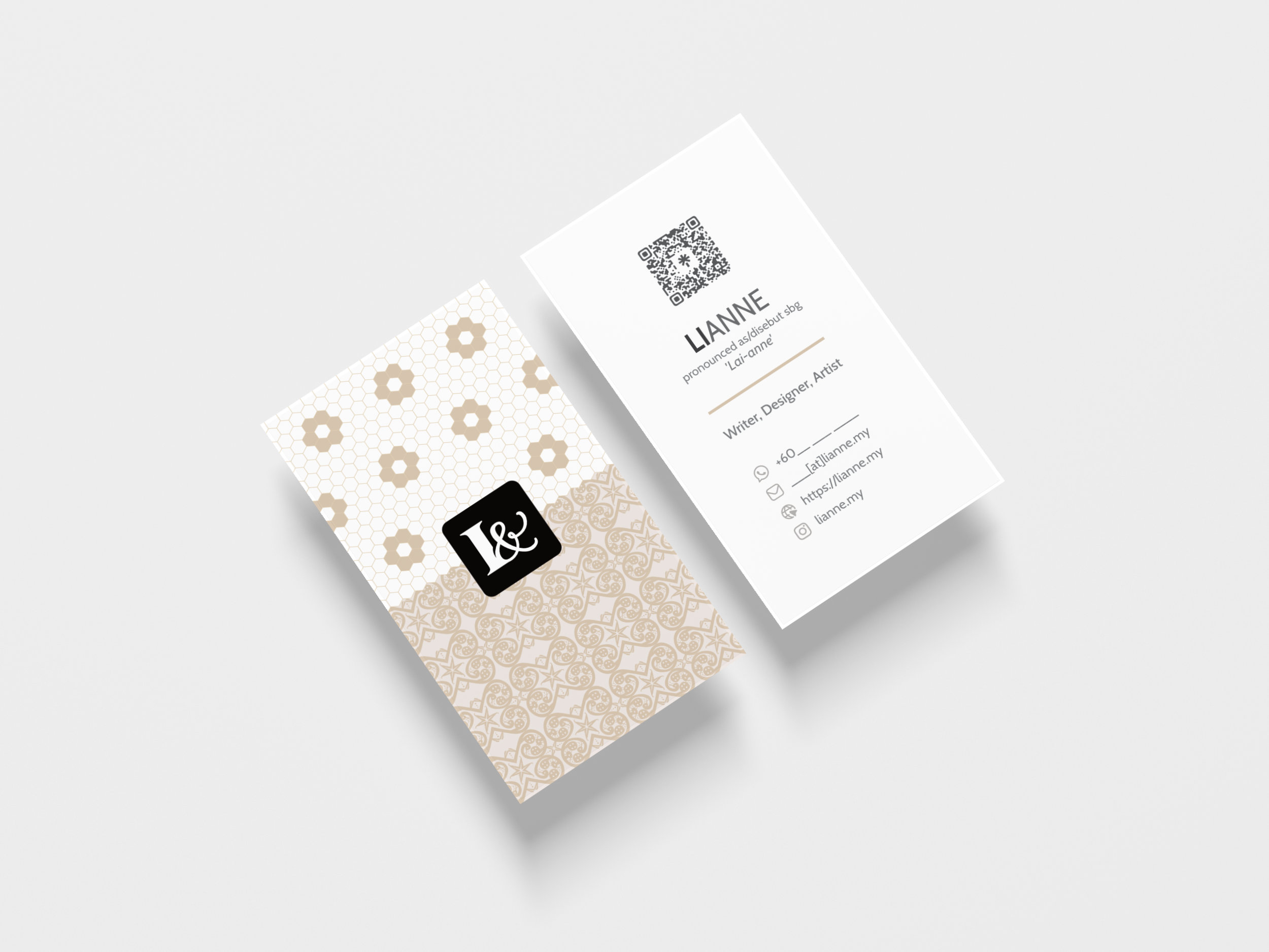
As I am dealing with interculturalism, I wanted to combine two typefaces into a monogram logo. The monogram is made of two letters: L and the ampersand (&). The reason why I combined L and & is that L is the first letter of my name, and & sounds like ‘Anne’. Also, I use ampersand to represent ‘Lianne &’, meaning me and others as we collaborate.
The combination of typefaces in the monogram logo reflects the different cultural types in the world. Some countries practice high-context culture, which uses implicit messages and non-verbal cues in their communication, while others practice low-context culture, which relies on explicit, direct communication. Living in a multicultural country with a history of postcolonialism, I am constantly navigating various cultural differences.
Hence, I believed in combining two typefaces into a single monogram to highlight this contrast. However, most online references use only one typeface. I did some sketches and found a solution to combine two typefaces into a single monogram.
Business Cards
Front design
With a similar goal of mixing two typefaces, I wanted to combine both geometric and organic patterns. Again, this proved to be a challenge because most references focus on either geometric or organic design, but not both. Moreover, combining geometric and organic patterns requires extensive experimentation, as the wrong mix can result in tacky visuals that repel viewers.
Thankfully, I found a visual combined both geometric and organic patterns in a hotel in Kuching. This Sarawakian rattan mat contrasted with the black-and-white hexagonal tiles, which originated in Western countries.
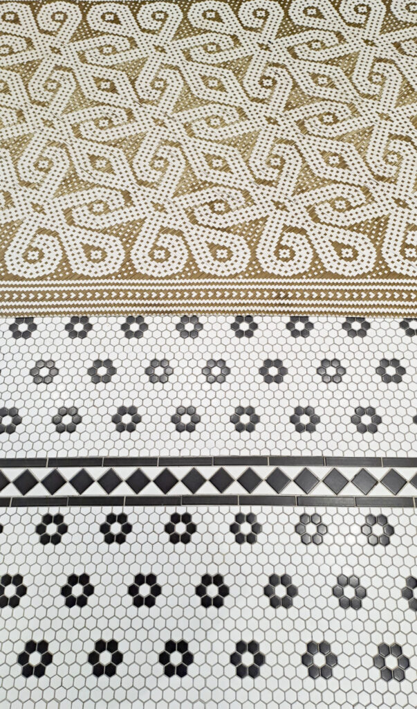
Reference image of mat and tile found in Legacy Hill Hotel.
Taking this mat and floor tile as a reference, I decided to create my own organic pattern rather than follow a Sarawakian motif, as I am not a Sarawakian. I referred to methods from the Basic Iban Design by Augustine Anggat Ganjing to understand the flow of repeating patterns. For the organic design at the bottom, I used midin (a type of fern) to create a generic pattern.
Back design
On the back of the card, I explain how to pronounce my name. Since this is my own business card, I had the freedom to do this. If I worked for another company, I wouldn’t be able to, since it would go against their branding rules.
Explaining how to say my name is tricky because people from different countries use different alphabets. Should I use the Malaysian English alphabet or the Indonesian alphabet? It is also unclear how many syllables are in Lianne. Some people say Li-Anne, others say Lian-ne, and some say Li-An-Ne.
To address this issue to the best of my ability, I decided to slightly bold ‘LI’ to read. The slightly bold syllable is based on a reading method called Bionic Reading to guide the readers. I also put “pronounced as/disebut sebagai Lai-Anne” to guide the majority of viewers. Depending on someone’s background, I risk having Anne being pronounced as ‘An-Ne’. Well, at this point, I am just offering a guideline on how to say my name.
04. Final Thoughts
When I got my printed business cards, I felt something finally clicked for me. It took years of working through different contradictions in life to create this logo and these cards. I also learned how to bend design rules and bring together contrasting elements to make something that fits. Before, I avoided mixing too many different things, but this time, I embraced them and made it work.